So I took the predictable flack from my “liberal” friends on Facebook after my recent comments on the “occupy Wall Street” business. There has also been much discussion of the protests elsewhere on the Internet. Eventually, these discussions turn toward uncomfortable things, such as facts and data.
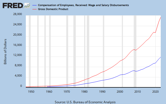
An article cited made much out of the fact that the portion of U.S. gross domestic product (GDP) comprised of wages and salaries has shrunk quite dramatically over the last 50 years. While this apparent disparity isn’t necessarily a cause for concern, the article’s evocative graphic led me back to its source, the Federal Reserve Bank of St. Louis. There, I examined the data for myself and built some of my own graphs.
The Federal Reserve data yielded two interesting and somewhat unexpected facts. First, the sharp decline in income (adjusted for inflation) beginning in A.D. 2008 is one of historic proportions. That alone can explain the unprecedented anguish so many people are feeling. They are suffering, or at least they’ve received quite a shock after decades of relative prosperity. It also explains why “occupy Wall Street” took me personally by surprise, as I will explain shortly.…
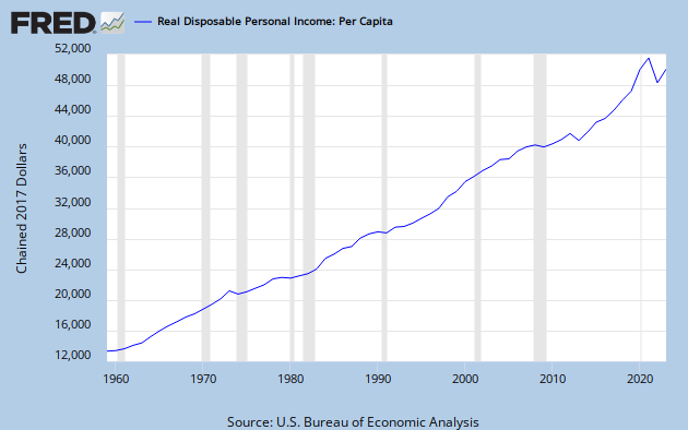
Second, the overall growth in real income was equally unexpected. I had long subscribed to the “liberal” economic theory that real wages had been generally flat or even declining for several decades, driving the proliferation of the two-income household. Now, if the data are to be believed, that notion must be largely false. Yes, we can surely parse the numbers to show how certain segments have not benefited, but that would turn us toward other uncomfortable things, such as personal choice and responsibility.…
However, my own observations have now been confirmed, repairing a troubling logical contradiction. Since the late 1980s, I have watched a dramatic increase in personal wealth among the general population. Since that increase only rarely applied to me, I explained it away as a personal sampling error. Nevertheless, the people around me in a variety of income brackets seemed to have plenty of food, personal electronics, and expensive telecommunication contracts. Indeed, prices in these sectors were either fairly flat or even declining in some cases.
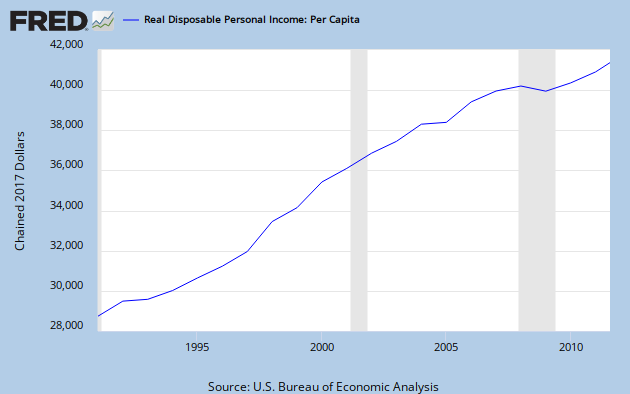
I’ve been a formal member of the workforce for 20 years now. As the graph above shows, change in real income was entirely positive during this period … until the financial crisis. My personal experience was very different. Though my working life has seen only three official recessions, my real income has been recessionary in nine of those 20 years. In other words, coping with declining wages has become normal for me.
The time when I felt the richest came shortly after I finished college and before my wife and I bought our house. Working full time, our disposable income increased rapidly but was still moderate. This allowed us to pay off our vehicles and student loans on time or early, so we were effectively debt free until buying our house.

That brief window of perceived prosperity came to an end when we became homeowners. In fact, the opening phase of my next personal recession was part of what enabled us to buy into an affordable housing program. Thereafter, my income continued to decline in real terms for six out of eight years. When it arrived, the great recession was simply treated as more of the same in my household.
Without digressing into those other uncomfortable matters, the moral of this post is that the financial crisis has had a profound effect on real income, much more so than I had thought. (Consider me properly chagrined.) However, the data also show the heretofore dramatic and largely sustained growth of that income. This latter fact should not be forgotten as we find our way out of the current crisis.
An article cited made much out of the fact that the portion of U.S. gross domestic product (GDP) comprised of wages and salaries has shrunk quite dramatically over the last 50 years. While this apparent disparity isn’t necessarily a cause for concern, the article’s evocative graphic led me back to its source, the Federal Reserve Bank of St. Louis. There, I examined the data for myself and built some of my own graphs.
The Federal Reserve data yielded two interesting and somewhat unexpected facts. First, the sharp decline in income (adjusted for inflation) beginning in A.D. 2008 is one of historic proportions. That alone can explain the unprecedented anguish so many people are feeling. They are suffering, or at least they’ve received quite a shock after decades of relative prosperity. It also explains why “occupy Wall Street” took me personally by surprise, as I will explain shortly.…
Second, the overall growth in real income was equally unexpected. I had long subscribed to the “liberal” economic theory that real wages had been generally flat or even declining for several decades, driving the proliferation of the two-income household. Now, if the data are to be believed, that notion must be largely false. Yes, we can surely parse the numbers to show how certain segments have not benefited, but that would turn us toward other uncomfortable things, such as personal choice and responsibility.…
However, my own observations have now been confirmed, repairing a troubling logical contradiction. Since the late 1980s, I have watched a dramatic increase in personal wealth among the general population. Since that increase only rarely applied to me, I explained it away as a personal sampling error. Nevertheless, the people around me in a variety of income brackets seemed to have plenty of food, personal electronics, and expensive telecommunication contracts. Indeed, prices in these sectors were either fairly flat or even declining in some cases.
I’ve been a formal member of the workforce for 20 years now. As the graph above shows, change in real income was entirely positive during this period … until the financial crisis. My personal experience was very different. Though my working life has seen only three official recessions, my real income has been recessionary in nine of those 20 years. In other words, coping with declining wages has become normal for me.
The time when I felt the richest came shortly after I finished college and before my wife and I bought our house. Working full time, our disposable income increased rapidly but was still moderate. This allowed us to pay off our vehicles and student loans on time or early, so we were effectively debt free until buying our house.

That brief window of perceived prosperity came to an end when we became homeowners. In fact, the opening phase of my next personal recession was part of what enabled us to buy into an affordable housing program. Thereafter, my income continued to decline in real terms for six out of eight years. When it arrived, the great recession was simply treated as more of the same in my household.
Without digressing into those other uncomfortable matters, the moral of this post is that the financial crisis has had a profound effect on real income, much more so than I had thought. (Consider me properly chagrined.) However, the data also show the heretofore dramatic and largely sustained growth of that income. This latter fact should not be forgotten as we find our way out of the current crisis.
No comments:
Post a Comment